
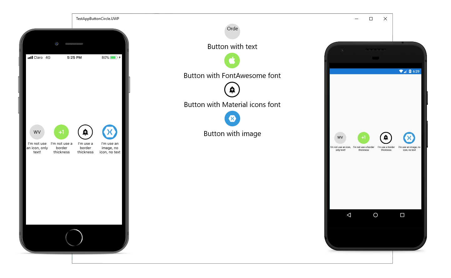
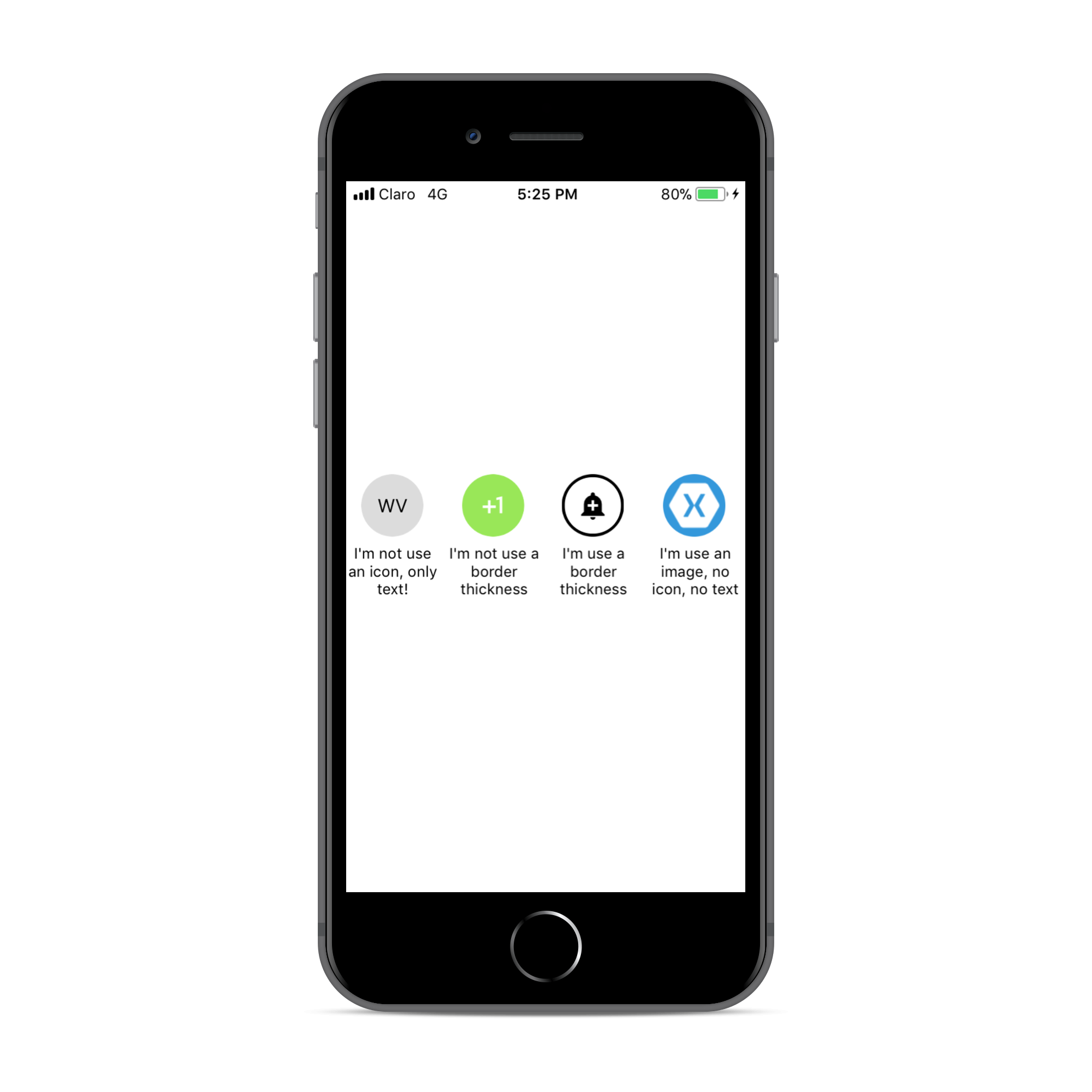
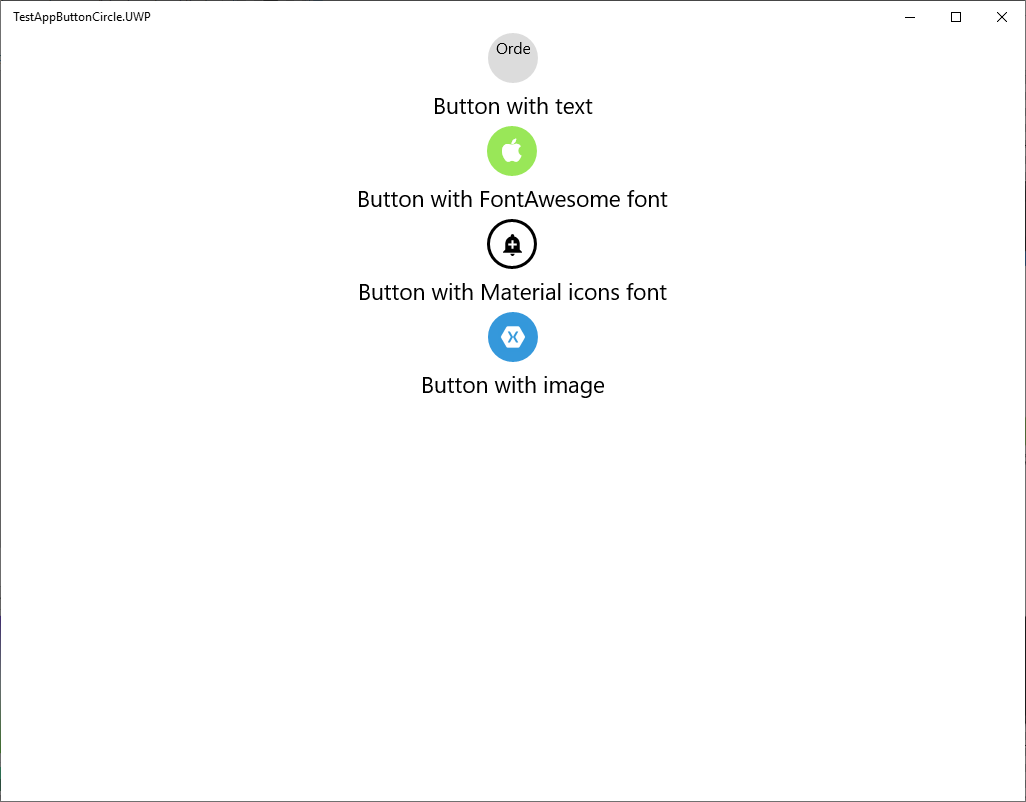
Simple but elegant way of display circle buttons with an icon in your Xamarin.Forms projects.

Material Design icons
FontAwesome
You must do this AFTER you call Xamarin.Forms.Init();
You MUST set the width & height requests to the same value. Here is a sample:
Setup
- Available on NuGet:
- Install into your PCL project and Client projects.
Android
In your Android project call:ButtonCircleRenderer.Init();
iOS
In your iOS project call:ButtonCircleRenderer.Init();
<key>UIAppFonts</key>
<array>
  <string>materialicons.ttf</string>
  <string>fontawesome.ttf</string>
</array>
UWP
In your UWP project add materialicons.ttf and fontawesome.ttf files to:Assets/Fonts
Material Design icons
FontAwesome
You must do this AFTER you call Xamarin.Forms.Init();
Platform Support
| Platform | Supported | Version |
|---|---|---|
| Xamarin.iOS | Yes | iOS 7+ |
| Xamarin.Android | Yes | API 14+ |
| Windows Phone Silverlight | No | |
| Windows Phone RT | No | |
| Windows Store RT | Yes(beta) | 8.1+ |
| Windows 10 UWP | Yes (beta) | Build 105086+ |
| Xamarin.Mac | No |
List of icons
You can see name of icons for FontAwesome here and for Material design icon hereUsage
Instead of using an Button simply use a CircleButton instead!You MUST set the width & height requests to the same value. Here is a sample:
new ButtonImage
{
  BorderColor = Color.Black,
  BorderThickness = 5,
  HeightRequest = 150,
  WidthRequest = 150,
  HorizontalOptions = LayoutOptions.Center,
  FontIcon = Fonts.Material
  Icon = "md-ic-add"
}
XAML:
First add the xmlns namespace:xmlns:local="clr-namespace:ButtonCircle.FormsPlugin.Abstractions;assembly=ButtonCircle.FormsPlugin.Abstractions"
<local:CircleButton
        FontIcon="Material"
        Icon="md-ic-directions-bike"
        FontSize="30" TextColor="Black"
        HeightRequest="70" WidthRequest="70"
        BorderThickness="5" BorderColor="Black"
        BackgroundColor="#DCDCDC" Clicked="CircleButton_Clicked">
</local:CircleButton>


0 comments: