FlexButton
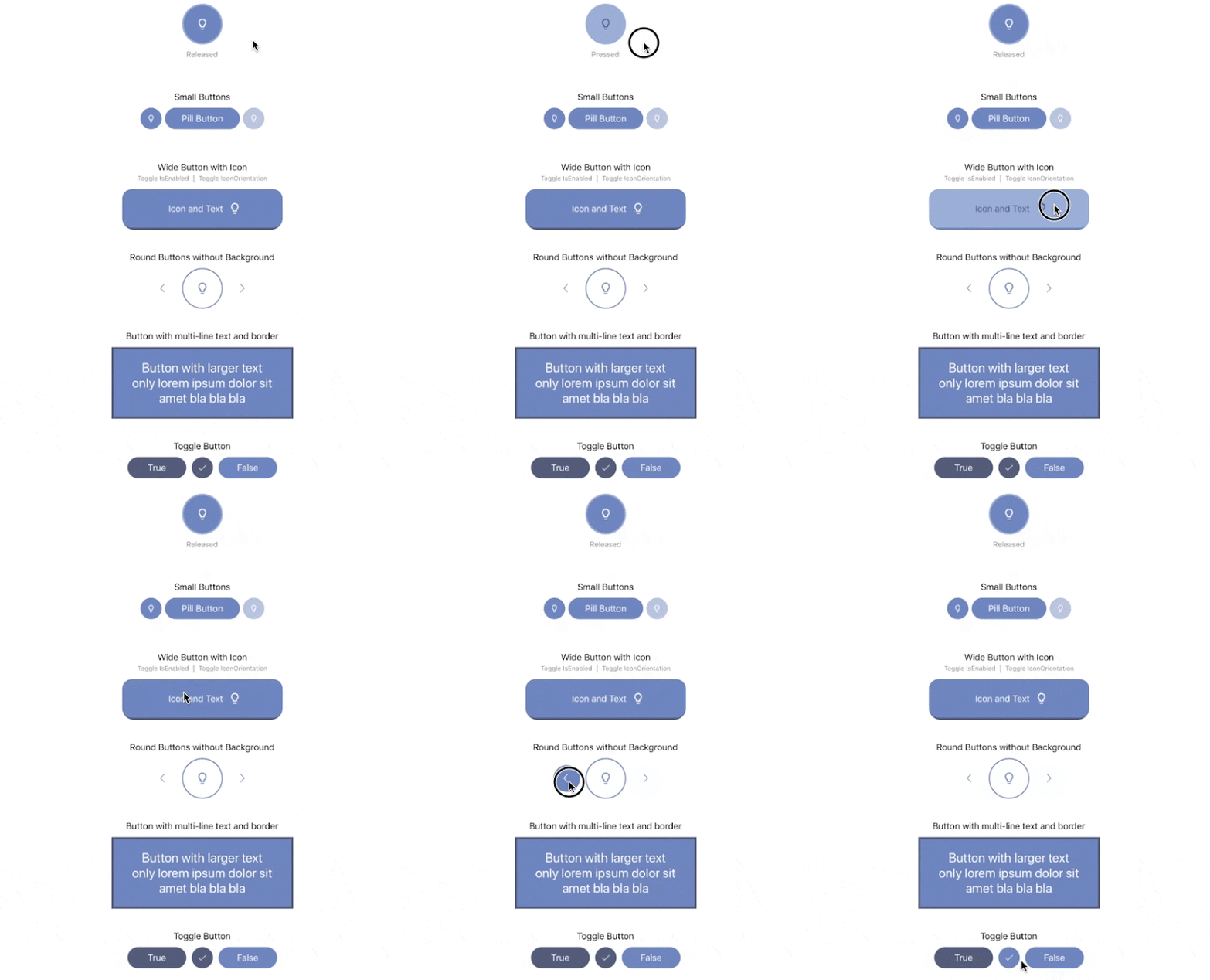
Flexible button control for Xamarin.Forms with events for different states, color overlays and adjustable shapes and paddings. Supports iOS and Android.
Features:
- Adjustable button size
- Icons with adjustable size
- Color overlays for background and icon (normal and pressed state)
- Events for button press and release
- Round button (corner radius)
How to use
Add the NuGet package to the Xamarin.Forms project and all platform projectsPM> Install-Package Forms.Controls.FlexButton
In your AppDelegate.cs call this after
Forms.Init();FlexButton.Init();
xmlns:flex="clr-namespace:Flex.Controls;assembly=Flex"
<flex:FlexButton
    WidthRequest="76"
    HeightRequest="76"
    CornerRadius="38"
    HorizontalOptions="Center"
    Icon="lightbulb.png"
    ForegroundColor="#ffffff"
    HighlightForegroundColor="#49516F"
    BackgroundColor="#6279B8"
    HighlightBackgroundColor="#8EA4D2"
    TouchedDown="DemoButton_TouchedDown"
    TouchedUp="DemoButton_TouchedUp"/>
Preview
Take a look a the Demo Project in this repository for a full sample.API Reference
| Property | Default | Description |
|---|---|---|
Icon |
null | Name of the icon file to use |
Text |
string.Empty | Button text to be displayed |
FontSize |
Default | Font size of the button text |
ForegroundColor |
White | Foreground color overlay for icon and text |
BackgroundColor |
Transparent | Background color of the button |
HighlightForegroundColor |
White | Foreground color overlay for icon and text when pressed down |
HighlightBackgroundColor |
Transparent | Background color of the button when pressed down |
CornerRadius |
0 | Button borner radius |
Padding |
30% of height, 10-30% of width | Inside distance from icon to button borders |
| Event | Description |
|---|---|
TouchedDown |
Triggered, when button got pressed down |
TouchedUp |
Triggered, when button got released |
Clicked |
Same as TouchedUP |


0 comments: